About Kwara
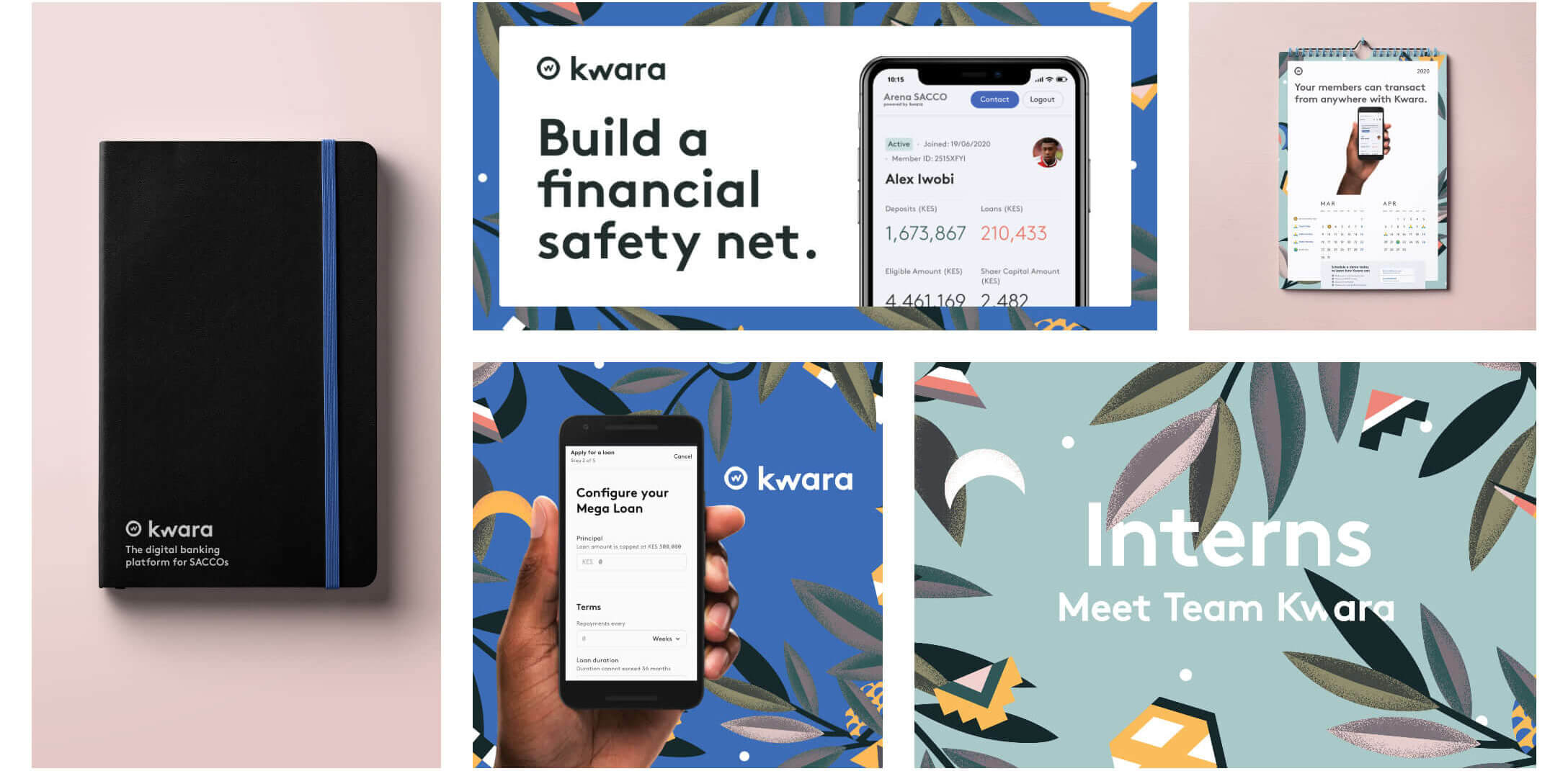
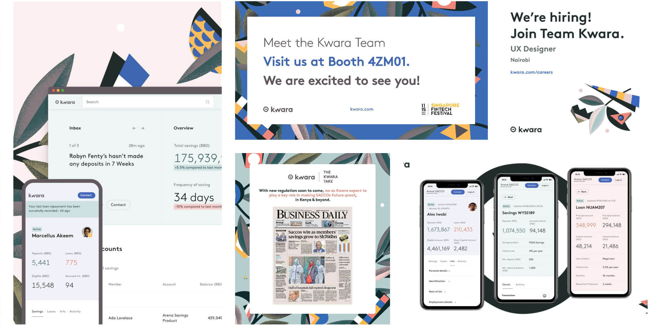
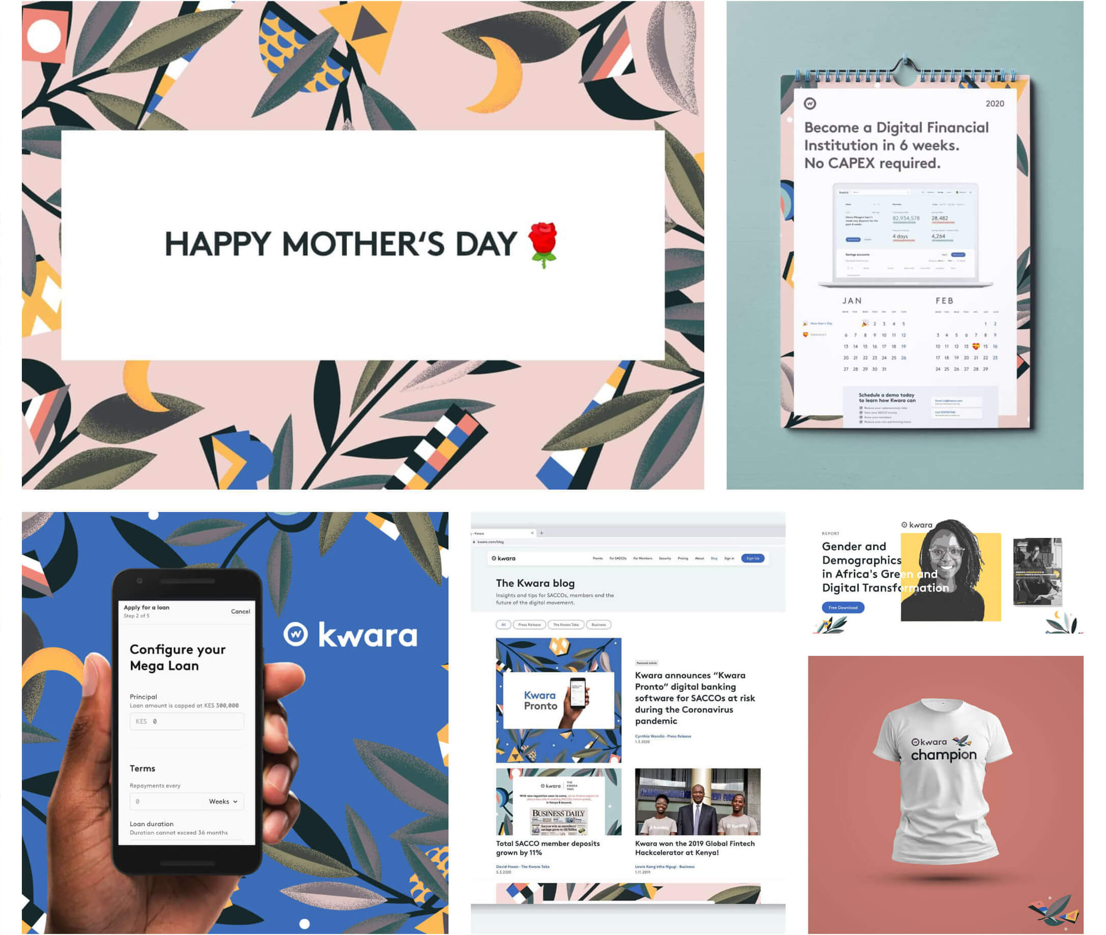
Kwara is a digital banking platform for credit unions (savings and credit cooperatives societies, SACCOs). It advances efficiency and automation at the cooperative staff level by providing them with its proprietary backend-as-a-service (BaaS) software, and the neobank-style mobile banking app is available for end clients.
Their mission? Bring modern financial services to 1 billion people, powered by credit unions to make building wealth together frictionless.
* Disclaimer: Some of the details in this case study may be vague to protect the client's intellectual property as it's under a Non-disclosure Agreement. Some design elements have been changed from the original.
Sneak peek

The problem
Tellers in SACCOs are responsible for managing the till to pay and receive cash from member contributions for either deposits or loan repayments and effectively handle customer transactions, delivering excellent client service and maximizing client solutions.
Teller supervisors couldn't drill down deep and get some of the information: who initiated the transaction, basically explore any entry, while there was still heavy friction of approval for treasury requests. I led the design of a new function for the till process to make it more intuitive and simple.
Researching the problem
Primary research
To fully understand the user’s approach on the challenges they face and how they see the platform making a difference in optimizing pain areas, I conducted one-on-one interviews with Tellers and Teller Supervisors. The interview sample took into account men and women aged from 25 to 40 working in SACCOs in the Enterprise plan. After this initial research, we had a better impression of the problem space and target audience.
“For one task, you have to have several sub-screens to just perform one task which took us back to amount take to handle the customer. Customer satisfaction index went below our expectations.” ~ Customer Service Supervisor
Personas

The research made it evident how different users (teller and supervisor) would use the app differently. To cater to this, I categorized them into two user profiles based on their goals and tasks.
Customer Insights
From the user interviews, contextual analysis and stakeholder interviews I gained qualitative insights. It also helped in understanding user expectations, behaviors, needs, and motivations. We then used these Insights to ensure that all product design decisions do benefit the user.
Secondary research
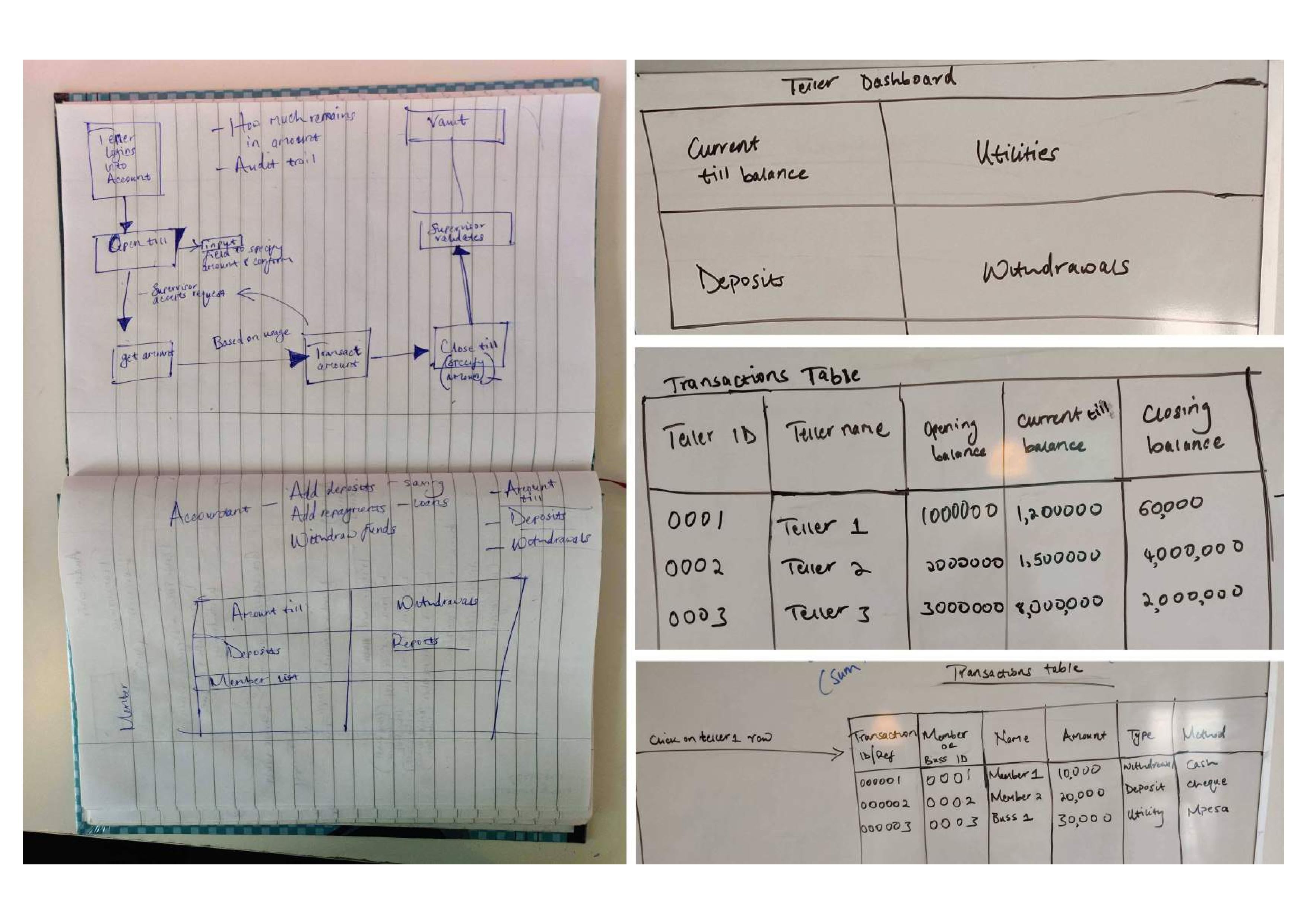
We also used the existing research provided by the Enterprise client which consisted of the current Payment Process Workflow and the visualized interactions of the teller with SACCO customers. It supported our primary research to understand the existing flows.


Exploring the solution
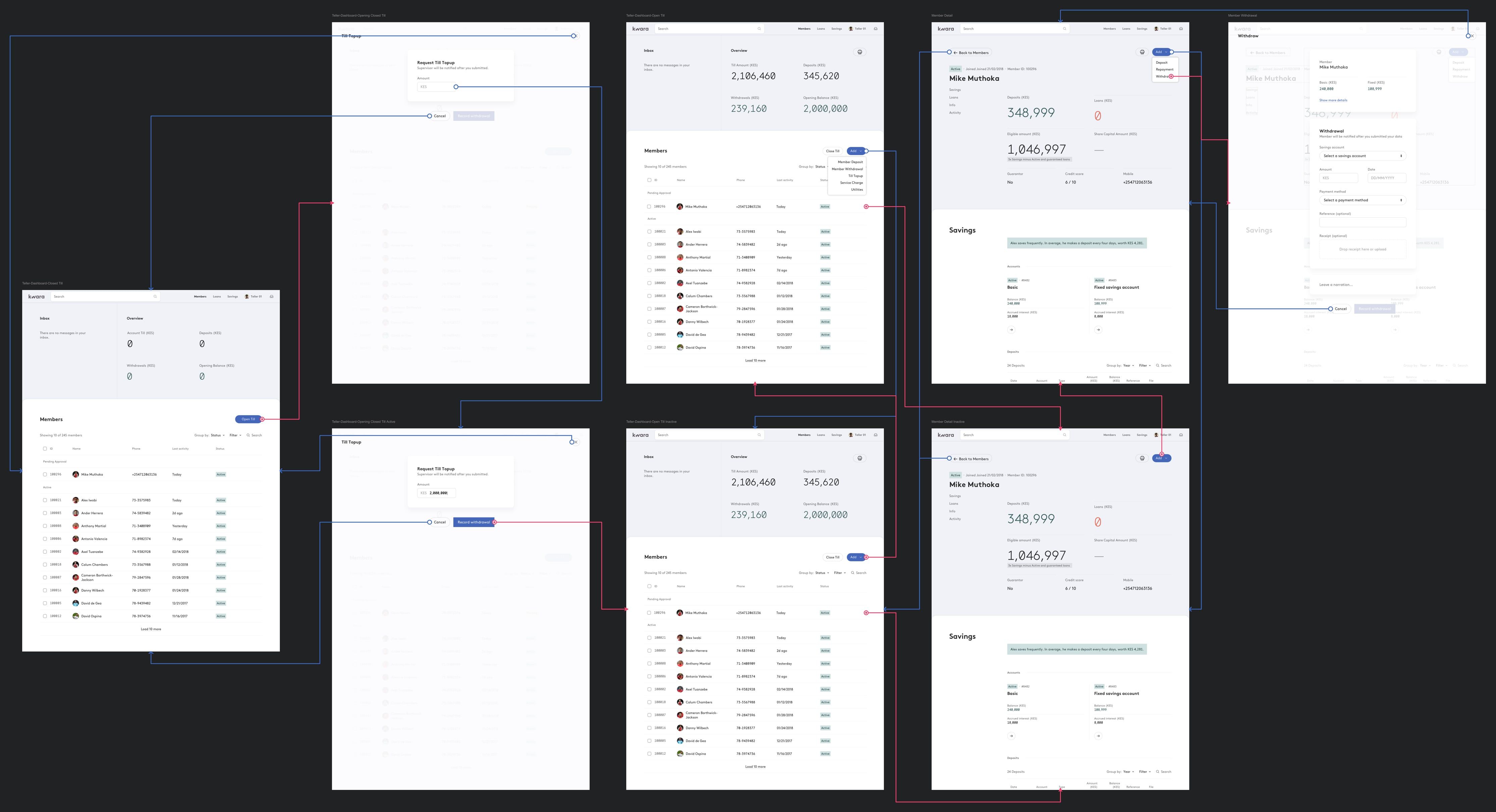
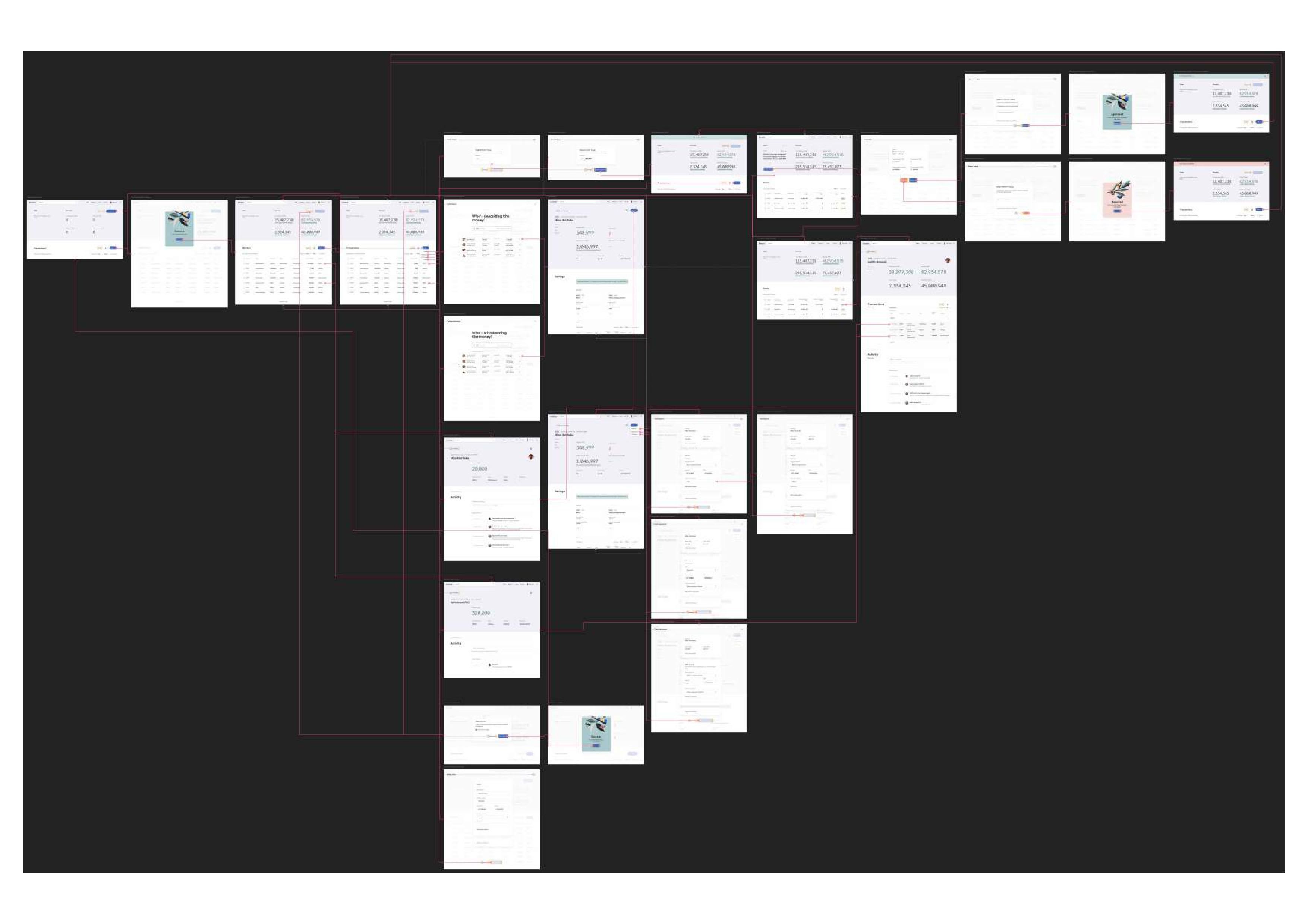
Using the insights I gathered from the research, we began creating user flows with the Product Manager.
I started creating the information architecture and low-fi concepts for primary use cases. After having a go-ahead from the Product Manager, developers, and Stakeholders on the mockups, we began digitalizing designs.

Learning from early prototypes
Usability Testing
We tested the product at current implementation of the Till function meets users objectives with regard to the JTBD. The Live product was tested with the stakeholders for one week to get feedback on the functionality, content, and interactivity of the product.
User Interface
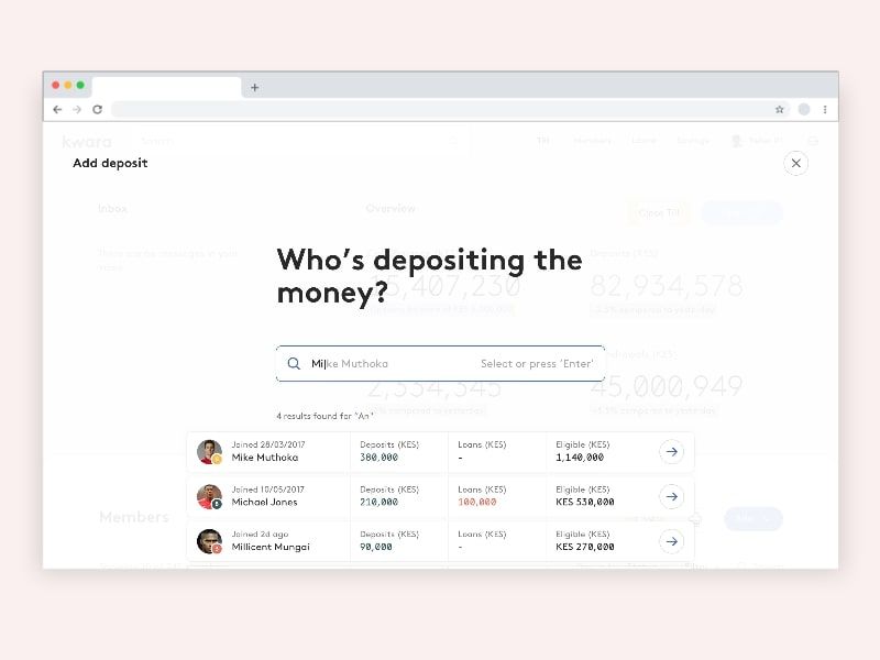
Single view transactions
Search provided a single view of key information of SACCO customers offering a great experience while initiating the capturing flow. Adding a deposit also is encapsulated into a detailed single view to capture full transaction details.
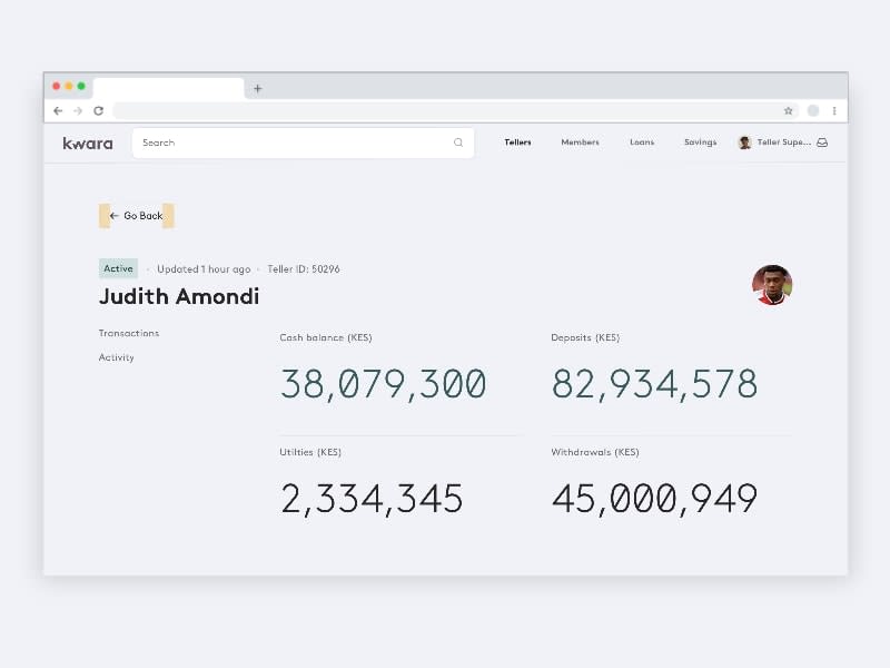

Real-time responses
A suite of alerts and notification modules to inform tellers about the state of their requests for topping up funds and closing till to share transaction summaries to supervisor.

Responding from home
The top up requests from tellers flow are immediately accessible to supervisors on the dashboard when managing the treasury fund. The flow was tested and optimized to increase speed and simplicity by focusing each view on a single request from the Tellers.
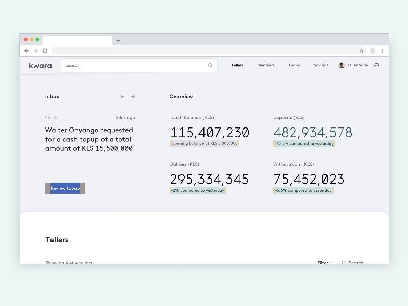
The response user flow
Responding to top up requests posted by Tellers presents all key attributes including, which teller, amount requested, current operating balance and a way to easily capture additional context for the supervisors decision.

Impact and Outcome
We released the feature update in September and are excited to be pulling in data from Hotjar with Google Analytics and using it to make more informed design decisions.

What next?
If I had more time, I would test with different SACCOs and their staff users to have context on the different mental models. Also, work with a data analyst to refine the analytics funnels to collect the right data as well analyze it to determine what to test and research more on for optimization purposes.
Other work in Kwara
